• Client

    Gravity Foundation Design System
  • Role

    Branding, Motion, UI, Design System
  • Year

    2023-2024
  • Platforms

    Web & Mobile
  • Project URL

Overview

Gravity is the design system developed for Doctor Anywhere, a leading regional healthcare company supporting the health and well-being of over 2.8 million people across Southeast Asia. The system is organized into two key categories: Foundations and the Components Library.

  • Foundations: These are the core visual elements that ensure cohesive, end-to-end user experiences. They provide guidance on essential design aspects such as iconography, typography, and color palettes, forming the visual backbone of our products.
  • Components: These are reusable, modular building blocks tailored to meet specific interaction or UI needs. Designed to work seamlessly together, components form the basis for creating patterns—predefined combinations of components that address common user challenges and enable intuitive user experiences.

    Gravity empowers teams to deliver consistent, engaging, and scalable design solutions across Doctor Anywhere’s platforms.

    **Disclaimer:** DA Gravity is the property of Doctor Anywhere and is presented here solely for sample work and portfolio purposes. As it was a collaborative team effort, I do not claim sole credit for its creation. The information I can share is limited to design elements only, excluding any business-related details. My contributions primarily involved component updates and improvements during my time at Doctor Anywhere.

Colour

We utilize color tokens to define and manage the colors used in our UI elements. These tokens play a crucial role in establishing the visibility, emphasis, and hierarchy of design components. By standardizing color usage, we ensure consistency, improve clarity, and enhance efficiency across the platform. Color tokens also simplify the design process by creating a cohesive visual language, making it easier to maintain and scale the system as needed.

Typography

We utilize typography tokens to style and manage text elements in our UI. These tokens ensure a consistent and cohesive approach to typography across the platform. They enable us to define styling decisions effectively, maintain visual uniformity, streamline updates, and enhance accessibility for all users. Typography tokens not only simplify design workflows but also contribute to creating a more inclusive and user-friendly experience.

Icons

Icons serve as visual representations of commands, devices, directories, or common actions, playing a crucial role in enhancing user interfaces. When used effectively, icons help maximize comprehension by visually conveying meaning and context, allowing users to quickly understand actions or navigate a system.
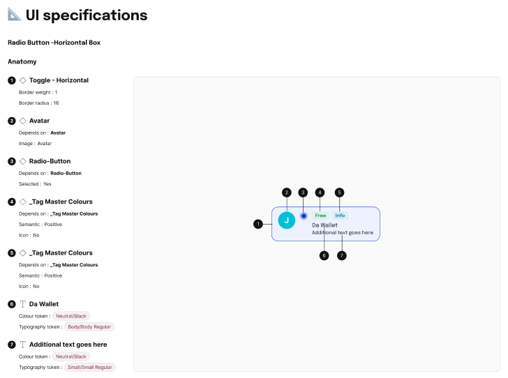
They also reduce cognitive load by providing intuitive cues, minimizing the need for extensive text explanations or complex instructions. Icons are particularly valuable when you need to draw attention to specific actions, commands, or sections of an interface. By offering a universal visual language, they improve usability, ensure accessibility, and contribute to a seamless and engaging user experience. Proper implementation of icons supports consistency, clarity, and the overall aesthetic of a design system.

Buttons

Gravity's component buttons are essential interactive elements designed to help users take actions efficiently and intuitively. They serve as the primary means for users to engage with the interface, guiding them toward completing tasks or navigating through the system.
These buttons are thoughtfully designed to ensure clarity, accessibility, and ease of use. Each button's style, size, and placement are optimized to draw appropriate attention while maintaining a cohesive look and feel across the platform.
The button components come with variations for different use cases, such as primary, secondary, and tertiary actions, ensuring users can easily distinguish between levels of importance or urgency. In essence, Gravity component buttons empower users by simplifying interactions and making actions clear, seamless, and efficient, all while contributing to a polished and professional user experience.

Input Field

Input fields are an essential element in our UI design, serving as interactive components that enable users to enter text and data. These fields are commonly utilized in form patterns, where they play a crucial role in collecting user information, facilitating interactions, and enhancing the overall functionality of the interface.
Designed to be intuitive and user-friendly, input fields provide a seamless experience by guiding users through tasks such as filling out forms, searching for information, or submitting data. They can be adapted for various use cases, including single-line inputs for concise text, multi-line fields for detailed information, and specialized formats for data like email addresses, phone numbers, or dates.
To ensure consistency and accessibility, our input fields are built to align with the design system's guidelines, incorporating clear labels, placeholder text, and error messages where needed. These features not only improve usability but also help users understand expectations and resolve issues easily. Input fields are a vital part of creating interfaces that are both functional and engaging, fostering a positive user experience across the platform.

Cards

Cards are a versatile and essential component of our UI design, offering flexibility for a variety of content and use cases. They are key elements in our design system, adept at displaying text, actions, and additional features in a clean, engaging layout.
Our cards can handle varying amounts of text, support up to two action buttons, and allow for the inclusion of tags, icons on the right, and data visualizations, enhancing their adaptability.
With their modular design, cards ensure a consistent and intuitive user experience, organizing information effectively while maintaining a visually appealing and user-friendly interface.

Selection Control

Selection controls allow users to make choices, toggle options, or input selections within the interface. They are essential components that enhance interactivity and guide user decision-making efficiently.
Selection controls play a crucial role in creating intuitive and user-friendly interfaces, ensuring seamless interactions across our design system.

Motion and Animation

Motion and animation play a crucial role in Gravity design system, enhancing user experience, guiding interactions, and adding a sense of fluidity. When properly implemented, motion helps create intuitive, engaging, and accessible interfaces.

Key Learnings

  • Working on this project has been one of the most fulfilling and transformative experiences of my career—a journey of continuous learning, growth, and discovery. It challenged me to refine my design approach, think critically, and embrace new perspectives. I was fortunate to have an incredible team that not only supported my ideas but also inspired me to push boundaries and strive for excellence.
  • One of the most valuable lessons I learned was the importance of feedback—both positive and constructive. Every critique, whether reinforcing a strong idea or identifying areas for improvement, played a crucial role in shaping my work. It reinforced the notion that design is a collaborative process, where iteration and refinement are essential to achieving the best possible outcome.
  • Working on the Gravity Foundation design system deepened my appreciation for consistency and precision. I learned to evaluate each component and element with meticulous attention to detail, ensuring accuracy beyond just visual alignment. It became clear that a well-structured design system is more than a collection of assets—it’s a framework that drives efficiency, scalability, and seamless user experiences.
  • My experience with this project, and at Doctor Anywhere as a whole, was truly unforgettable. It taught me that design extends far beyond aesthetics; it’s about solving real problems, creating meaningful impact, and building long-term solutions that contribute to the success of both the product and the company. This journey has reinforced my passion for user-centered design and has left me with invaluable skills and insights that I will carry forward in my career.

Previous

Share On